Evoke Solar Inc's Web Design
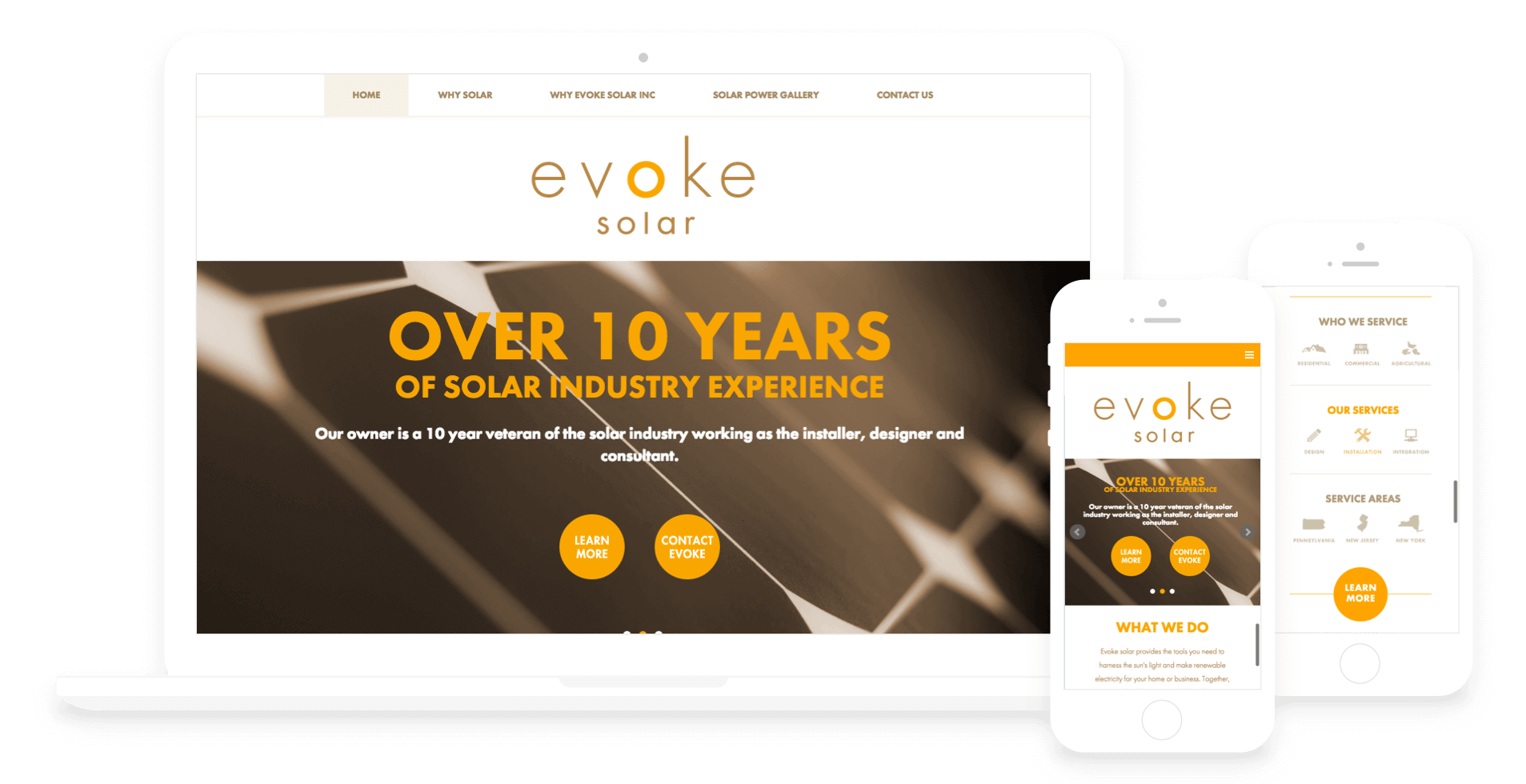
A Responsive Wordpress Website
-
Wireframes
-
Website Design
-
Front End Development
-
Animation

Previously I have worked with Wes Checkeye on a successful identity and branding project for Evoke Solar Inc. And now it was time to help him launch a website for the company as well.
First and foremost we needed to launch a single page temporary site. There were a series of industry conferences and conventions that were coming up quickly and we needed to launch a small single page site that acted as a digital business card until we could get a full site up and running.
Once the temporary site was up, we immediately started planning the full website launch. Wes committed to writing all the content for the site himself, since he has over ten years of experience that spans all of the company's current services. After the content was written, I started to block out wireframes for each unique page type. Then we passed content and wireframes back and forth to refine and build simultaneously until all the details were worked out in our information architecture.
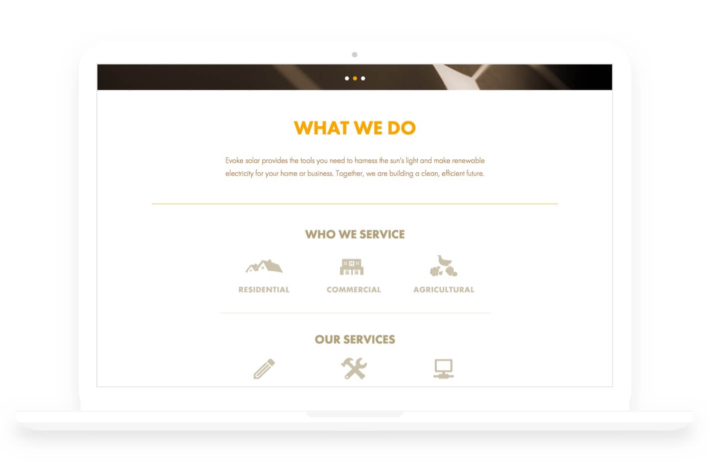
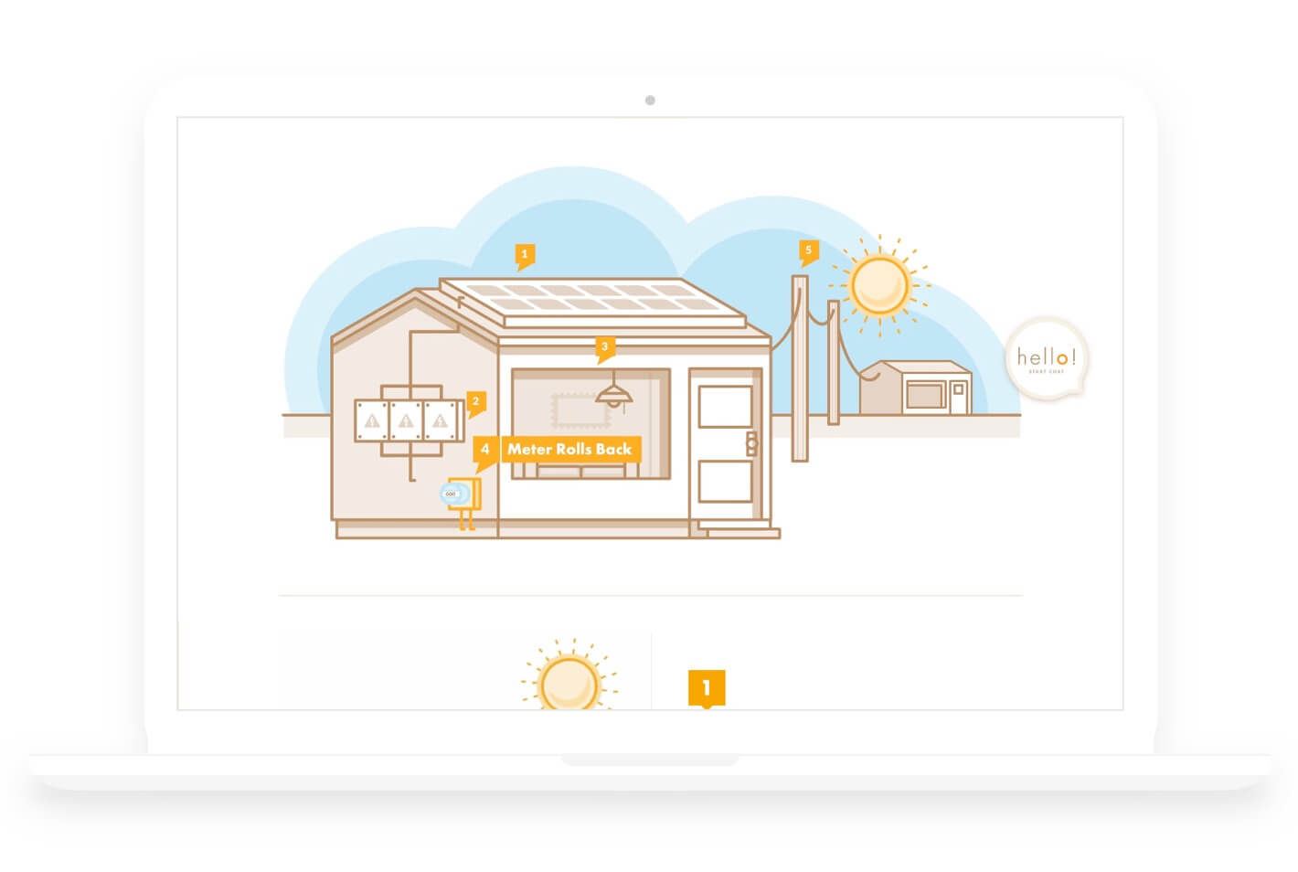
The primary goals of the site are brand awareness, user edification, and driving users to contact Evoke to get a solar energy system installation quoted. The site also needed to take very technical solar energy systems and processes and break it up into friendly, and easy to swallow blocks and have ease of access to contact Evoke for any questions or to pursue the design and purchase of a system. Wes also requested that the Evoke website use Wordpress as a content management platform, since that was one he was familiar with.
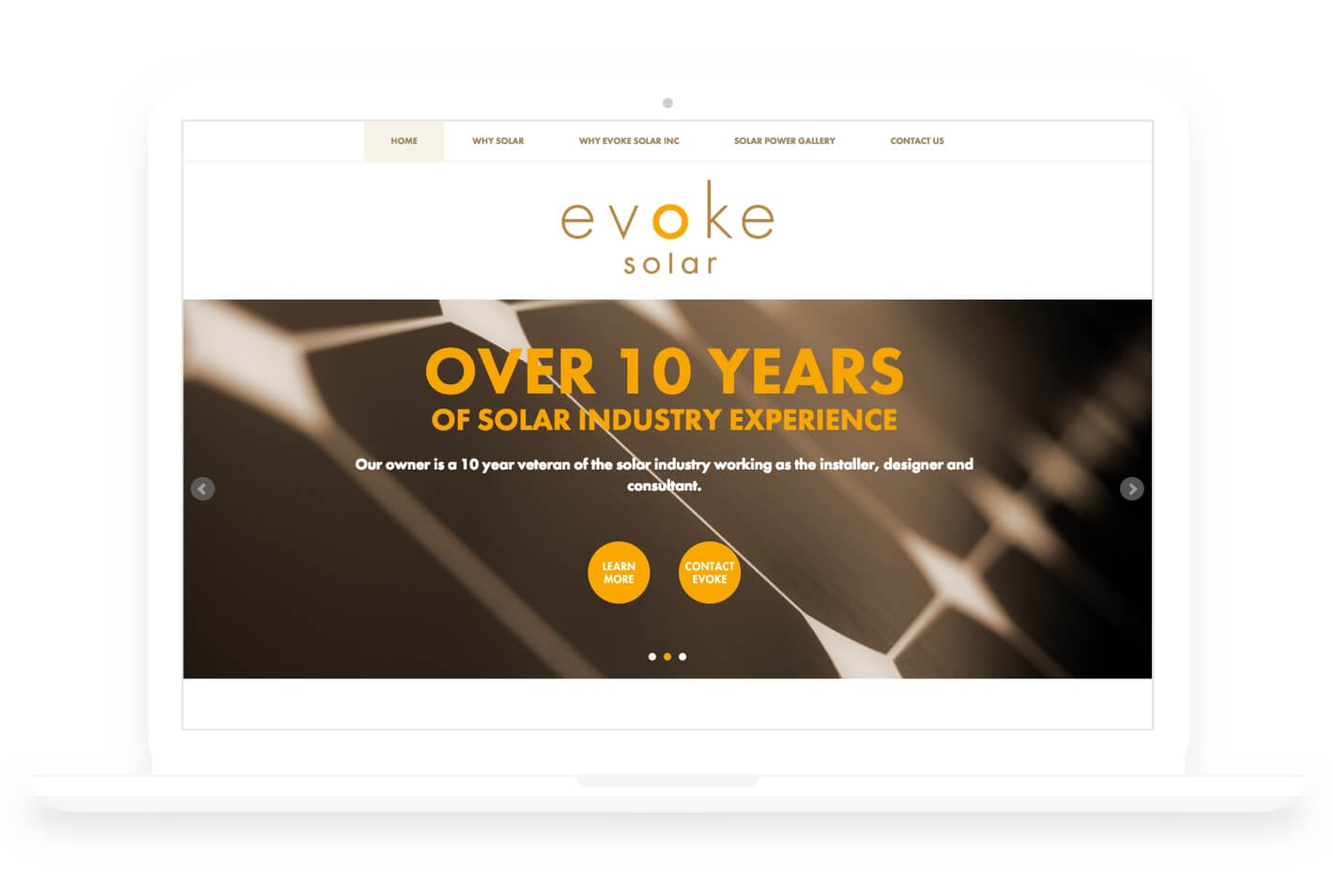
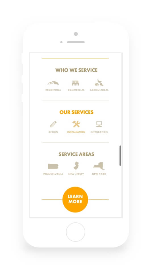
With the site being on the small side I opted out of using any major frameworks like bootstrap for our responsive site. Many of the pages are on the long side, so we opted for a sticky header/nav that will always be visible and make jumping around the site easier. The footer was kept short and sweet, and with all of our links in our sticky menu, there was no need to flood the footer with anything beyond a few social media links. To encourage the user to reach out, we also included a prominently placed contact form on the homepage, and placed a focus on requesting free quotes for system design and installation.
All in all, this project ran like a well oiled machine, smoothly transitioning between each phase without so much as a hiccup. As a designer and front end developer, you wish all projects went this smooth.
